ASEAN Infographics: A new approach to visualize regional statisticss A new approach to visualize regional statistics
Wednesday, April 10, 2019 11:04
ASEAN Infographics: A new approach to visualize regional statistics
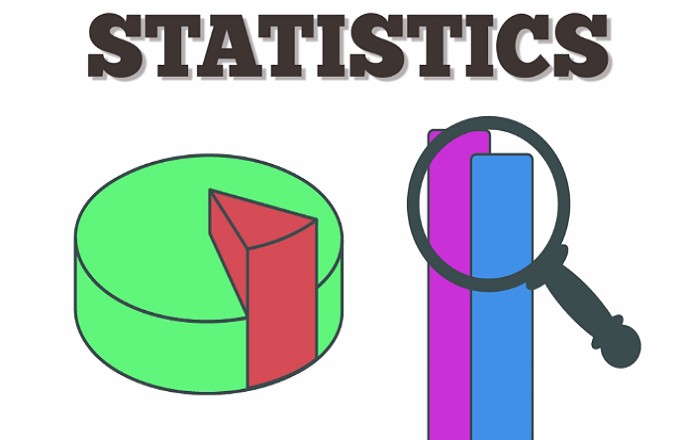
Visualisation of statistics and data is an important method that helps users to understand the results of experiments and simulations. It’s indispensable to the verification process and the deep comprehension and communication of the data, particularly for decision making. Visualisation of data and statistics focuses on techniques for presenting data in visual ways to support understanding of the underlying patterns, whether it’s done for research, scienceor for decision makers. Using these special techniques, visualisations help to communicate complex science to a general audience.
Recently, ASEAN Statistics has made an big attempt in disseminating regional official statistics by using various tools from webpage, database, presentations, … as well as to visualize data. Users can access to those regional statistics from following link: https://www.aseanstats.org
Here are some main screenshots of ASEAN Infographics and selected thematic infographics:
ASEAN Statistics main page

Infographics on ASEAN 50 years progress


Infographics on Glossaries
The glossary of terms and definitions of statistics are intended to explain and help users to understand the meaning of statistical terminology and to make them more comfortable in reading the report/brief with statistical terms. Some examples are given with data to ease in understanding the meaning of terminology.


Infographics on ASEAN Statistical Highlight 2018
ASEAN Statistical Highlights 2018 is a visual presentation of ASEAN statistics covering economic and socio-demographic sectors.
Infographics on ASEAN Community Progress Monitoring System 2017
ASEAN Community Progress Monitoring System (ACPMS) 2017 publications are consist of a master book and 4 leaflets (infographics).

Other news
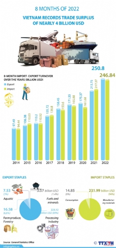
- Vietnam records trade surplus of nearly 4 billion USD in eight months(9/16/2022 10:51:43 AM)
- Vietnam reports trade surplus of nearly 4 billion USD in eight months(8/30/2022 3:55:09 PM)
- Agro-forestry-aquatic product exports rise over 13% in eight months(8/30/2022 3:50:51 PM)
- Trade surplus to hit 1 billion USD this year(8/24/2022 3:17:48 PM)
- Seafood exports expected to reach $3b in Q3(8/15/2022 9:58:47 AM)
- Vietnam eyes global top 10 in agricultural processing(8/12/2022 12:36:32 PM)
- Preliminary assessment of Vietnam international merchandise trade performance in the first half of July, 2022(8/10/2022 1:57:37 PM)
- Agro-forestry-fishery exports exceed 32 billion USD in first 7 months(8/10/2022 1:48:48 PM)
- Top five items with export earnings exceeding US$10 billion each(8/10/2022 1:41:28 PM)
- Industrial production index up 8.8% in first 7 months of 2022(8/8/2022 9:55:37 AM)